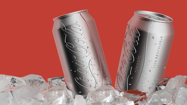
Most spec redesigns of classic brand logos aren't that great, so I cringed when I saw that someone was putting a new spin on Coca-Cola cans. Turns out I underestimated Ryan Harc, whose colorless can with a convex logo pressed right into the aluminum is pretty snazzy.
This apparently might be more eco-friendly than painting the cans, as it could reduce energy use and pollution in both the production and recycling processes. Plus, it looks like it was dispensed from a vending machine in The Bourne Identity, which is a good thing.
Not that Coke is going to ditch its iconic red anytime soon, of course.
Via PSFK.